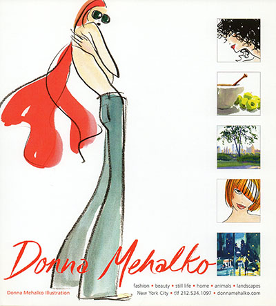
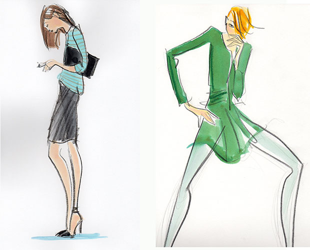
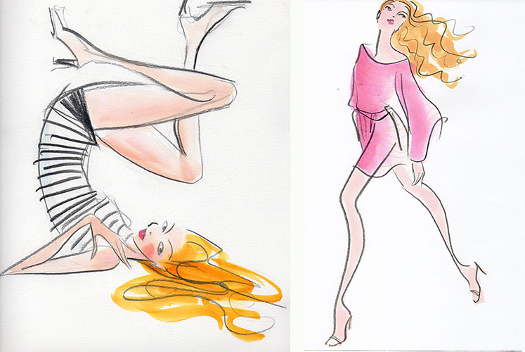
Much like an artisan, illustrator Donna Mehalko adds an artistic value to a luxury brand. At the start of her career, she moved to New York to work with Lord & Taylor, before designing a full page ad in the New York Times besides working with marquee names like Neiman Marcus and Estee Lauder. Mehalko draws her influences from pop culture and from the buzzing, vibrant city of New York.
In 1987 you began to work on contract for Lord & Taylor. What was the job profile like? And what was your experience working for a brand?
I was hired by Lord & Taylor on a freelance basis to illustrate the advertisements that ran in the New York Times for a shop in the store called ‘Express Yourself’, which focussed on contemporary fashion.
There was usually a full page ad on Sundays and a small one on Thursday. I had a wonderful experience working with an amazingly creative team. Each week, I was sent two outfits and a rough layout that the art directors sketched for me to follow, but I had a lot of freedom to interpret as long as I was true to the garment.
Since then, you have worked with several brands. What sort of equity has an artist like you brought to the brands?
I think when I am hired by a brand the client is interested in presenting their brand artistically allowing for some interpretation by the customer. When I worked for Henri Bendel, the art director was always looking for an illustration that was evocative of the fashion rather than a recreation.
Especially in fashion, I think a sophisticated customer likes the element of suggestion that illustration brings. I find the words ‘movement’ and ‘creativity’ tend to come up in the direction I receive.
Which is that one design project you believe proved to be a game-changer for a brand? Or the one that you enjoyed doing the most?
A recent client, Eileen Fisher hired me for a project to aid in updating their image and to give the brand a bit more edge, even while remaining true to their brand. I loved working with them and felt we were good fit because I think the client sees herself as someone who can put her own individual spin on the clothing. Illustration underlines the creative element of the brand.
What sort of a role do beautifully designed collaterals and packaging play in the success of a brand? Can you give an example?
I recently illustrated a holiday card for a company known for electronics. It was interesting to see how the art director chose to focus on the human element of the company by using illustration. I think the card represented the company’s reputation for personal service and quality in a surprising way.
Can you give us an idea on the process involved while designing for a brand? For instance, what are the elements that you need to keep in mind while designing marketing collateral?
To some extent, every project is unique in how I would approach an illustration. But, I do my best to try to see the project through both, the eyes of the client and the customer. I rely on my art director to point me in the right direction, then I try letting the product inspire me to create something that I would want to represent myself. A favorite art director I work with often says to me, “Now, do it different”. I try to keep that in mind to produce something that surprises myself.
Are you, as an artist, free to interpret a brief from a client? Or are you expected to follow the brand manual strictly?
I feel that the client usually knows their customer. But, I think that working with an art director, my job is to bring an artistic element to what they are trying to convey in their branding, hopefully elevating their image.
While designing marketing collaterals and packaging, do you follow any trends in art, design or even pop culture? Can you give us some examples of clients you have done that for?
I try to follow trends in pop culture. Living in New York means there is constant exposure to all aspects of culture, high and low. I’m sure somehow that filters into my work. Especially in retail advertising and collateral, I think it’s important to touch on some elements of what is happening on ‘the street’. Whether it’s in styling or attitude, it helps make the illustrations feel right. But, I try not to follow trends in illustration, because I think the personal vision an artist has is really the most valuable thing one has to offer
What kind of value do illustrations and art add to a luxury brand?
I may be biased, but I think an illustration can bring a sense of uniqueness to a brand. Generally I would say the more sophisticated the client, the more they value illustrations for highlighting the aesthetic and exclusive image of their products.
How has the art of packaging and designing marketing collateral evolved over the last five years?
Of course there is more digitally produced illustration than there was even five years ago. But, I would say that many luxury products are still keen on using an illustration to achieve a level of originality and erudition in their brand. Luxury brands and the ‘artisanal’ quality of illustration make sense. Luxury brand clients appreciate the ‘hand’ in illustration and how that reflects on their products. I think that is why we see a lot of hand lettering now, because everyone has a computer and can easily generate type, so standard type has lost a lot of its effectiveness.


